With a wedding coming up this weekend, and needing to post some portrait sessions, I have decided to give the logo contest its very own page. Click on the page (in the right column) to go see all of the options and vote. I will tally all votes together from the post and page. Votes...
Monthly Archives: June 2008

For a while now, Aron and I have been discussing an “update” for my logo. When I started, I wanted my logo simple in design and pretty much straight to the point. I have kept the same design but changed the font used. There are three options here, the original and two others. I would...
I vote #1. I think that it is a very distinguished logo. Very classic.
I vote #1 also. #2 looks too playful in my opinion. #3 isn’t bad, but #1 is my first choice by far.
-Andrew and Erin
my vote is #1…i agree with andrew and erin about #2 & #3. I’m going to try and design one so I can win a session and that 8×10!!! 😆
I still like the original logo the best (#1). #3 is my second choice.
I like #1. It’s classic, can’t go wrong!
#1. Classic and easy to read!
My comment is showing up in an enormous font and I do not know why. Sorry. I wasn’t trying to scream my opinion. 🙂
I think you should just change your name and start completely over
 Maybe with Orange and Purple in your logo. Just kiddin….I like the first one too. Sometimes change isn’t good. BP
I definitely like #1 the best- very professional!
#1 is my favorite! It really makes a statment!!
My vote is for #1 without a doubt! Classic, distinguishing and very professional.
#1 is still my favorite, but my second choice is now probably #6. The bad thing about #6 is that the whole oval thing is probably a fad that will have people spending a Saturday sometime next year scraping stickers off their car because it’ll be out of style by then. So I’d say stick with #1 – I think you got it right the first time.
wow, that’s large type on the comments there. The comment above was written by me (Andrew), but Erin says that she likes #5 except change the “Portrait Photgraphy” to have it written smaller and have portrait under Collin and photography under Smith.
She loves the way Collin M Smith is written
My vote is for #5. I think you need something more creative, something with a little flair. Your photography and talent doesn’t really fit a “BOX”, think outside the box…!!! This is fun…great idea getting people’s input.
I’m kindof liking #5 also and would like to see Erins suggestion with the portrait photography a little smaller.
Number 1 or the last one.
Number one b/c it is the easiest to read. I sent you another idea…. like your original options but using the Nice font. You’ll have a great logo matter what. Fun contest!
My favorite is #1, ALTHOUGH #5 is super cool too.
We are back from a FUN week at the beach! We went down with my family (Aron) and enjoyed tons of swimming, jumping waves, building sand castles, eating, talking, and relaxing. It was a wonderful week! We didn’t do any portraits of the kids while we were down there, but I thought I’d add some...

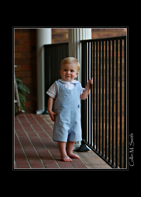
What a handome little guy! Collin had the pleasure of doing Boyd’s portrait session in his yard a few weeks ago. This is one of my favorite toddler stages…when they are learning how to be stable walking outside and exploring their surroundings. I’m so glad that Boyd’s parents chose to do the session here!
Simply adorable, He’s my GRANDSON!
Those are AWESOME!!!!
TOO CUTE!!! Almost as good as seeing my nephew in person!
Too cute for Words..Diana
I just love these pics…. He is so adorable. Thanks for sharing.


